Let's say you are a front-end developer.
And you've been tasked with creating the UI portion of a blog that is powered by a headless CMS like Contentful, Sanity, Prismic, Strapi (or even Wordpress).
There are dozens of elements / components you need to account for. The first time I had to do this, I missed many of them and they popped up in production, completely unstyled 😳
This post is going to be an exhaustive list to make sure you've got all of your bases covered. For a TLDR, scroll to the bottom!
Components that live outside of your content body
1. Breadcrumbs
This is usually one of the first things you'll see on a page, though it's usually less conspicuous since the primary intent is to let search engines know about your site structure and hierarchy.

To see our Breadcrumb component, go here.
2. The Hero
The "Hero" is your intro to the blog post or article and usually contains four or five pieces:
Title
Cover image
Date published or updated
Author info
Categories / Tags
Here is a well designed hero from SIG. They also include an intro snippet which gives a brief overview of the content:
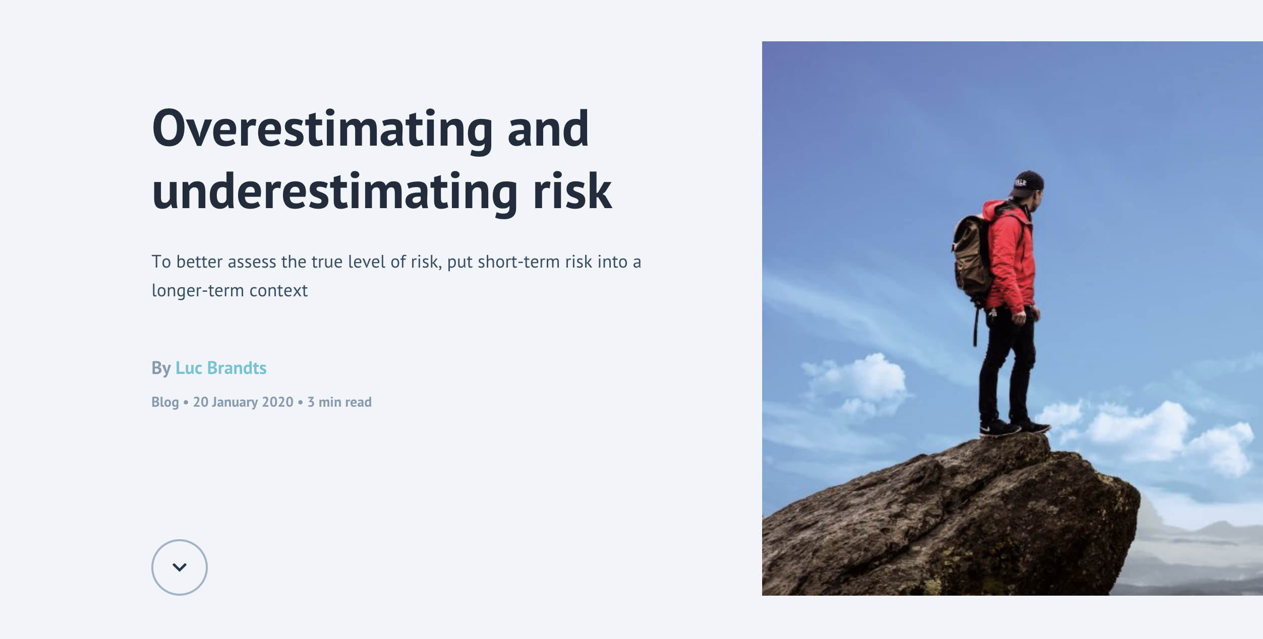
Check out the docs for our Hero component here.
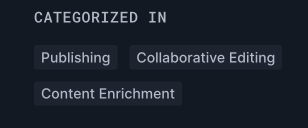
3. Categories
Categories also known as "gags" are not a necessity but often a good way to bucket your content. You may not even notice them most of the time.
That's because they, like breadcrumbs, are more to please Google in once again understanding the hierarchy of your site's content.
4. Table of Contents
A table of contents is useful in giving readers a preview of what's to come, and allowing them to jump from section to section.
Once again, and you may be noticing a trend here - this is super helpful in allowing search engines to understand your page's content structure. They can ultimately end up helping your click-through rate on the search pages if you get what are know as jump-to links:
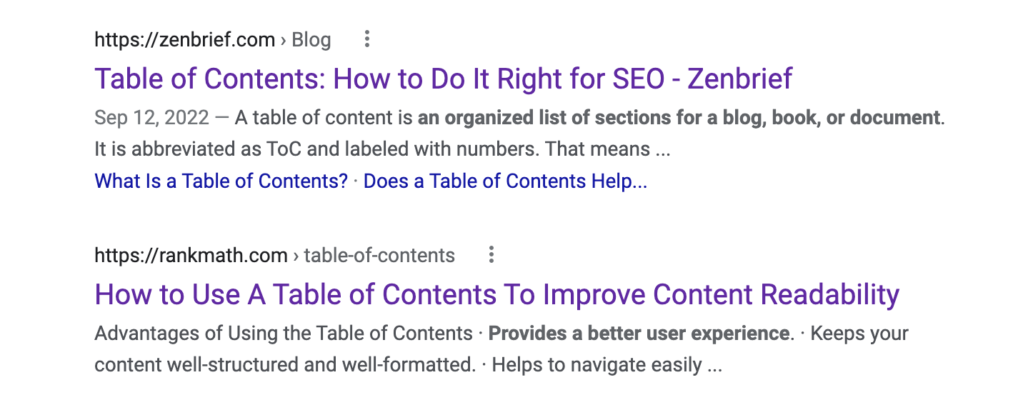
See how the first result has extra links below it? This might not seem important but it increases the amount of room your result takes up on the page and statistically improves your click-through rate.
Check out the docs for our Table of Contents component here.
5. Socials
Who knows if anyone actually still clicks these in today's world, but nevertheless we typically want to include either links to our social media pages or shareable links that allow you to share the pages to your social channels.

Check out the docs for our social media component here.
6. Author Bio
The author bio often comes at the end of the article. As we mentioned before, you can also include some info on your author in the hero. Having a little bit more about the author at the end never hurts, especially when linking to an author bio page.
Keep in mind, the whole goal is to improve that EAT (expertise, authoritativeness, and trustworthiness).
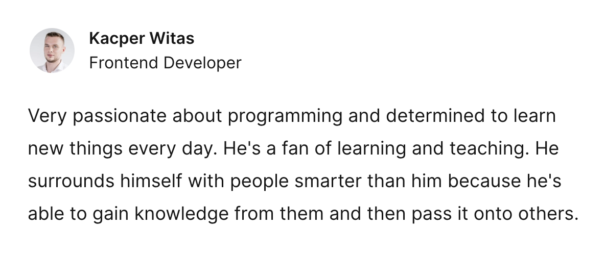
Check out the docs for our author bio component here
7. Sources & Citations
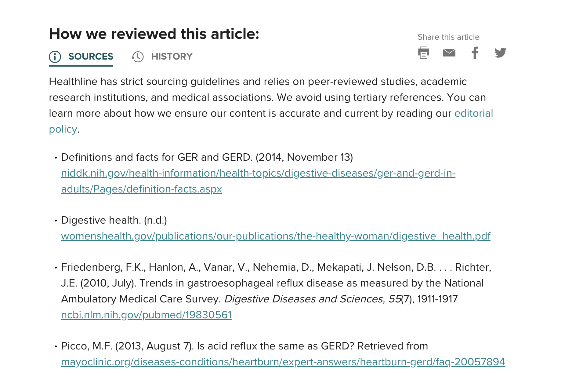
Less rarely needed are the sources and citations section. These are really only necessary for educational material or niches like healthcare and science. We do not yet have a component for this, but will be releasing one in the future.
8. Related Articles
Pretty self explanatory. Another important element for promoting your material and pointing Google to other pages on your site. Remember, interlinking is very important to helping search engines traverse your site.
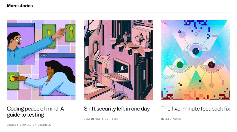
This component is coming soon from Headless Templates.
Content Body Elements
These are mostly native HTML elements that live within your content, but also include some custom React components (e.g. video embeds and enlargeable images).
Let's start with the basic HTML elements that require some design love. (Our PostBody component handles the styling for all of the following cases):
9. Headers
We account for H1, H2, H3 and H4.
10. Lists
This is an example of an unordered list. Headless templates is great because...
It saves you dozens of hours of dev time
It optimizes for SEO
It takes into account accessibility
It looks good out-of-the-box
11. Paragraphs
We asked ChatGPT why one should use a headless CMS as a demo paragraph. Here's what it said:
A headless CMS can provide greater flexibility, scalability, and security for your content management needs. It can also make it easier to integrate your content with other systems and applications, allowing you to create a seamless user experience across multiple platforms.
12. Quotations
Here is a preview of our styled blockquote:
Simplicity is the keynote of all true elegance.
- Coco Chanel
13. Links (anchor tags)
This is going to link to our twitter account as an example.
14. Text: Bold, Italic & Underlined:
Bold, italic and underlined text
15. Inlined Code
Here is some inlined code: console.log('meow')
16. Horizontal Rules
Here is an example of how our horizontal rule (hr) looks out-of-the-box:
Lives in the content body, but is a component
Next we have our components that live within the content that are extensions of native HTML elements.
17. Images
Sure, images are native elements. But we often want them to be more than just static images. For example, our Image component does two things:
Allows you to click on it in order to open within a modal-like view and see an enlarged version of the image.
Shows a caption below it that displays the
alttag.
You can see many examples of this component above.
18. Code Blocks
Like images, there is a native way to display code blocks using markup. For inlined code, we just use a code tag but for blocks of code, the proper approach is to use the pre tag.
With that said, we often want to spice things up and give our code proper highlighting based on the language used, and also allow for the user to easily copy the code with the click of a button.
This is why we created the CodeBlock component.
Here is an example:
19. Video Embeds
Video embeds are always tricky.
There are many different services you might want to embed from like Youtube, Vimeo, Wistia (and many others).
You want the video to maintain a proper aspect ratio across a broad array of devices.
You probably want the videos to lazy-load in the background so they don't affect your page load time.
You might want to control the videos (stop, start, pause) programmatically.
For this reason, we've created a component that wraps a reliable and well-known library that handles all of these cases called React Player.
20. Call-outs
Call-outs are pieces of content that are tangentially related to your main content. Oftentimes it will be a piece of meta commentary or perhaps a call to action. We handcrafted a call-out component specifically for this.
Here is an example:
21. Table
Here is a summary of all the elements and components discussed in this article, using our table styling:
Element / Component type | Location on page |
|---|---|
Breadcrumbs | Outside of content body |
Hero | Outside of content body |
Categories | Outside of content body |
Table of Contents | Outside of content body |
Social Media Links | Outside of content body |
Author Bio | Outside of content body |
Calls to Action | Outside of content body |
Sources & Citations | Outside of content body |
Video Embeds | Content body |
Code Blocks | Content body |
Images | Content body |
Lists (ordered and unordered) | Content body |
Tables | Content body |
Quotes | Content body |
Calls to Action / Callouts | Content body |
Headers | Content body |
Paragraphs | Content body |
Links | Content body |
Text: Bold, Italic, Underlined | Content body |